


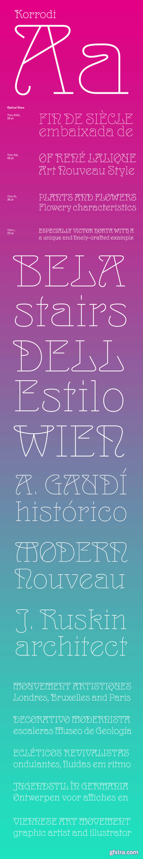
Korrodi Font Family
Korrodi, named after the Portuguese (Swiss-born) architect Ernesto Korrodi (1870–1944) is a mono-linear version of the popular Art Nouveau typeface Arnold Böcklin, first published in 1904 by the Otto Weisert foundry and named after the Swiss symbolist painter Arnold Böcklin. A true display typeface, Korrodi is available in a single Thin weight with four optical sizes; L, XL, XXL and XXXL allowing a precise balance for different display sizes. It includes a large character set with an alternate for the lowercase ‘a’, and it can be the perfect choice for poster, packaging and editorial design.


https://www.myfonts.com/fonts/paulo-goode/didonesque-script/
Didonesque Script has the flair of a script typeface, yet retains the rigid structure and incline of its cousins in the Didonesque family. This makes for an interesting approach – the flamboyancy of this script is restrained which resonates a distinctly reserved and formal tone. This typeface is perfect for formal occasions, with its main intent for use in short runs of text, headlines, branding and logo applications.

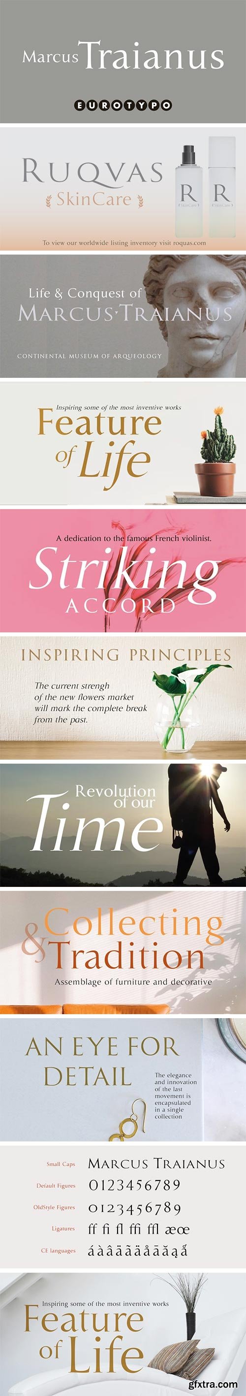
https://www.myfonts.com/fonts/eurotypo/marcus-traianus/
The famous lettering “Capital Trajana” (inscription at the bottom of the column that bears its name erected in the year114 A.D.) is usually identified as the classic example that defines Imperial Capital forms. However, much earlier, there were already countless examples of Greco-Roman epigraphy of excellent execution, as evidenced by the monumental inscriptions from year 2 b.C. sculpted in the Portico di Gaio e Lucio Cesari in front of the facade of the Basilica Emilia, in the Roman Forum, erected by Augustus, dedicated to his two grandchildren for propaganda and dynastic needs.
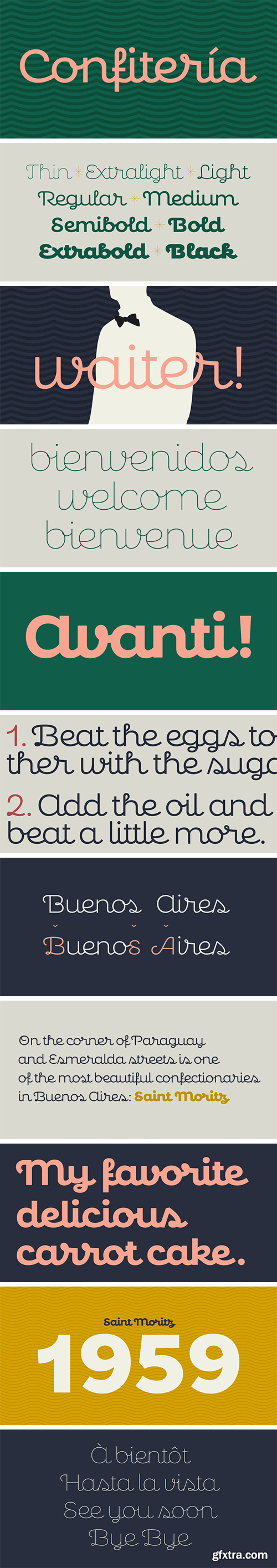
https://www.myfonts.com/fonts/sudtipos/confiteria/
Confitería is the Spanish word for a shop where sweets and chocolates are made and sold, which sometimes has a tea room. And now Confitería is also a font that brings to mind lettering piped on delicate cakes ... sweet but never sickly.
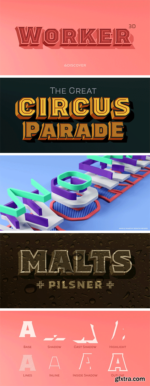
https://www.myfonts.com/fonts/ndiscovered/worker-3d/
Worker 3D is the tridimensional version of Worker. The tridimensionality enhances the vintage feel of the original design. It has 8 different layers so there are plenty of possibilities, you can use all 8 layers at the same time or have a more sober look by just using some outline and shadow or some lines texture. You can create astounding lettering in a matter of seconds. Make great logos, eye-catching typographic posters, re-create vintage packaging, and much more.


SermonBox - Seasonal Collection

SermonBox - The Series Pack Collection

Top Rated News


Would you like to be a Author?